
The Image module is used to add an image with title and caption on your site.
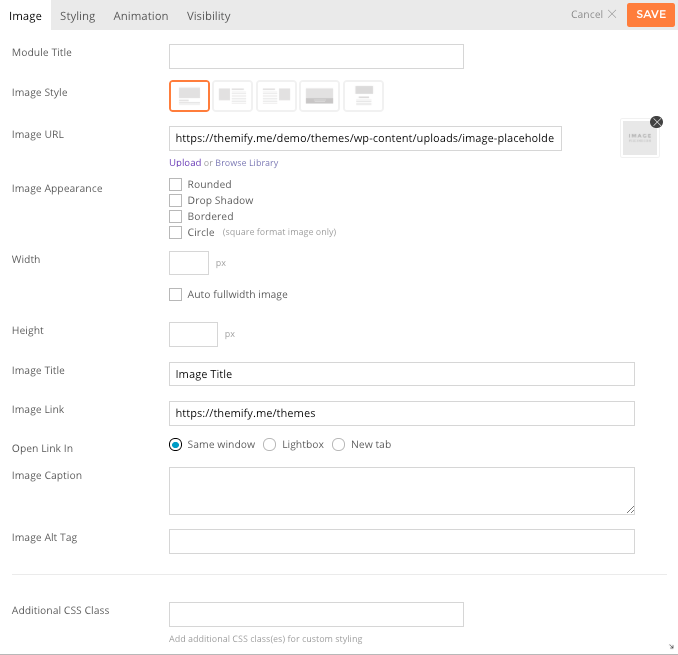
- Module Title This option is used to add the title of your module.
- Image Style This option is used to determine the layout of the image and any title and caption.
- Option 1 Title/caption will be shown below the image.
- Option 2 Image will be shown on the left and Title/caption will be shown on the right.
- Option 3 Image will be shown on the right and Title/caption will be shown on the left.
- Option 4 Title/caption will be shown in an overlay on top of the image.
- Image URL This option is used to set/upload an image URL to use for the module, or alternatively you can select an image from your website's media library by selecting "Browse Library".
- Image Appearance These options provide the ability to toggle various effects to be applied to the image.
- Rounded Toggles whether the corners of the element should be rounded.
- Drop Shadow Toggles a drop shadow effect on the element.
- Bordered Toggles a border around the element.
- Circle Toggles whether the element will be rendered as a circle. (Requires images used be square ratio)
- Width This option sets the width of the image output.
- Height This option sets the height of the featured image output.
- Image Title This option is used to set the title of the image being added.
- Image Link This option is used to set the URL that is linked to by the image being added.
- Same window open link on the same window.
- Lightbox This option is used to link the icon or custom image and title to open a URL in lightbox.
- New tab If checked this will open the URL into a new tab.
- Image Caption This option is used to set a caption for the image being added.
- Additional CSS Class This option allows you to add any custom CSS classes you wish to be output with the module.